The biggest exhibition of typefaces and texts as visual art is being held at the former Seoul Station, shedding light on the transformation of typography and the act of writing and reading in the digital age.
The third Seoul International Typography Biennale, which kicked off Friday, explores the dual role of typography ― as a language and visual art ― through works by 58 international artists.
First launched in 2009, the typography biennale is the only biannual exhibition in the world devoted to typography and its transformation from a design aspect.
The exhibition follows progress in texts through the transformation of typefaces, reading habits and its effect on book designs, and intangible words that only exist online.
 |
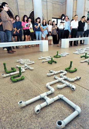
A press tour is held at the Seoul International Typography Biennale. (Typojanchi 2013) |
Various typefaces in multiple languages ― mostly in Korean, Japanese and Chinese ― are on exhibit in the first section titled “Typography as an Art of Language” on the first floor.
Typography designer Lee Ho’s pipe installation, shaping the sentences of the famous poem “Green Grapes,” welcomes guests as they enter the spacious hall through the front gate.
Ahn Sam-yeol presents a modern version of the Korean classical writing style, featuring skeletal, yet flowing features. On a long poster he has created his own form of Japanese typeface in a way that shows what Kana, or Japanese script, characters might have looked like if they were written horizontally.
The exhibition not only showcases different typographies, it also features conceptual works that seem to engage texts and literature with their original meanings. However, the vague and complex descriptions fail to help viewers understand the connection.
Studio Moniker’s video installation, which projects light onto a colored surface, creates simple shapes such as a circle, a triangle and a rectangle that explore an approach to literature. But once again, the description is just too difficult for average viewers to understand the artist’s intention in connection with literature. Other descriptions fall short of guiding viewers through many conceptual works on display.
Viewers enter a world of complete typography on the second floor, where books with unique design value are on display.
“The book itself is an art of typography,” says Ahn Sang-soo, a Hongik University professor and one of the organizers of the biennale event.
The second section of the exhibition, “Forms of Reading,” displays books made with careful consideration to the size of texts, lengths of sentences, and spaces between words to offer a pleasant reading experience. Some works with unusual design features enhance the reading experience.
Text in the poem “Secret Language” by poet Kim Kyung-ju is written with big spaces between the words to express the rhythm and pauses in the poem.
 |
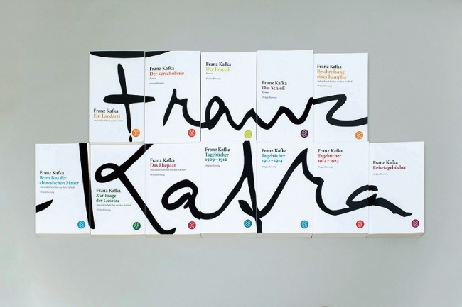
Design for the Kafka collection by the publishing company Fischer Taschenbuch (Typojanchi 2013) |
Often the book cover is the final aspect that moves buyers to pick up a particular book at a bookstore. The design of the Fischer Kafka collection, consisting of 12 volumes, features sophisticated abstract black strokes on the cover, which make up Kafka’s signature when the 12 books are lined up together.
Digital media has moved texts from conventional media onto diverse platforms.
Finnish artists Sampsa Nuotio and Raisa Omaheimo created “Google Poems” using the Google search engine’s auto-complete suggestions. Some random sentences and phrases form poetic lines on a print-out in the exhibition hall.
A program named “Decodeunicode,” created by a design department led by professor Johannes Bergerhausen of Mainz University in Germany, plays all the 109,242 characters of the languages spoken in the world.
On the media faade across from Seoul Station, collaboration works by young Korean artists and poets will be on display through Oct. 11.
The biennale continues through Oct. 11 at the Culture Station Seoul 284 in Seoul Station. Admission is free. The exhibition is open from 10 a.m. to 7 p.m. It is closed on Mondays and during the Chuseok holiday.
By Lee Woo-young (
wylee@heraldcorp.com)


![[Exclusive] Hyundai Mobis eyes closer ties with BYD](http://res.heraldm.com/phpwas/restmb_idxmake.php?idx=644&simg=/content/image/2024/11/25/20241125050044_0.jpg)
![[Herald Review] 'Gangnam B-Side' combines social realism with masterful suspense, performance](http://res.heraldm.com/phpwas/restmb_idxmake.php?idx=644&simg=/content/image/2024/11/25/20241125050072_0.jpg)

