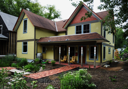
MINNEAPOLIS ― Most people who update their homes want them to look bigger, better and newer. But Brita Hansen and Eric Hazen wanted their remodeled Minneapolis home to look like its small, 1880s self.
“We really liked the proportions of the original house and the gables,” Hansen said.
They bought the house, their first, in 2004. And while they loved their location and didn’t want to move, they were ready for something a little roomier, more functional and more refined.
That posed a dilemma: How do you expand a modest house without making it look like a bloated McMansion in a neighborhood where many of the homes date back to the 19th century?
The solution wasn’t quick or easy, but the end result was worth the time and toil. Today, the newly remodeled home blends with its neighbors while still giving the couple another 750 square feet of living space in addition to the 1,100 they started with.
In the process, Hansen and Hazen kept the things they love about their home: its traditional gabled look, the Seward neighborhood and their deep lot. (Both are avid gardeners, interested in edible landscaping and urban homesteading.) And they’ve fixed the things they didn’t love: not enough bedroom space and a strange staircase that divided the living room.
The couple did a lot of the work themselves, with help from relatives and friends, including demolition, tile work and interior painting. That saved them about $70,000 off the cost of the remodeling, their designer estimated. “We like the creative process, especially working with tile,” Hansen said.
 |
The exterior view of Britta Hansen and Eric Hazen’s south Minneapolis, Minnesota home is featured, May 9. (Minneapolis Star Tribune/MCT) |
But they knew that designing an addition and integrating it with the existing house was going to be way beyond their DIY skills, so they turned to Michael Anschel, principal/designer at Otogawa-Anschel.
“It was one of the most challenging things I’ve ever designed ― resolving the exterior so it’s in scale and style with its surroundings,” he said. “We went through version after version. There was a lot of thinking, digesting and sharing of ideas ― a lot of minds coming together.”
The final design of the remodeled home was inspired by an offhand suggestion to build another house next to the original one.
“That was a really good idea,” Anschel said. “It ended up solving a lot of issues.”
Instead of one big boxy addition, the addition is recessed in the middle of the house to minimize its visual impact from the street. Inside, instead of bigger multi-use spaces, the couple has compact cozy rooms more typical of the home’s original era than of today’s open floor plans.
“We wanted relatively small, functional spaces,” Hansen said. “That was important to us, rather than having large rooms you don’t use.”
The remodeled home exudes Old World charm but many of the features that contribute to it aren’t original. When the couple bought the Victorian-era house, it had none of the decorative flourishes associated with that time period.
“It was a workingman’s house, probably a railroad worker,” Hansen said.
“There probably never were a lot of fancy things here to salvage,” Hazen added.
So the couple gave their house a charm retrofit. Their antique buffet is an architectural salvage piece, sawed in half to get it through the front door, then refinished and rebuilt in the dining room. The gleaming wood floors in the kitchen are made from local elms, salvaged by Wood From the Hood, a reclaimed lumber company in the Twin Cities. The vintage and vintage-look tiles, light fixtures and woodwork were salvaged, found on eBay and crafted by handy friends.
Before the couple picked up their paintbrushes, Anschel developed a Victorian-inspired color palette of peaches and plums, greens and golds.
“Color is one of our specialties,” he said. “We do it as a team, on-site, looking at how the light is moving, how one color works with another as you walk through the space.”
The historic colors, cozy rooms and vintage touches seamlessly blend the old and new sections of the house.
“My favorite comment is when someone says, ‘I can’t tell what is original and what is the addition,’” Hazen said. “That, to me, is a huge compliment.”
The couple uses every room, as they intended. “There’s no wasted space,” Hansen said. And they agree that the remodeling has made their house much more livable. “It’s really enjoyable to be in these spaces,” Hazen said.
That’s good, because they plan to live there a very long time.
“We’ve put so much of ourselves into this house...,” Hazen said.
“... we’re staying here until we’re too feeble to get up and down the stairs,” said Hansen.
By Kim Palmer
(Star Tribune (Minneapolis))
(MCT Information Services)


