South Korean internet giant Naver said Friday that it would use a new “green dot” interactive search button as the core of its new design direction for its mobile site, aiming to bring smarter and more integrated web search functions to users.
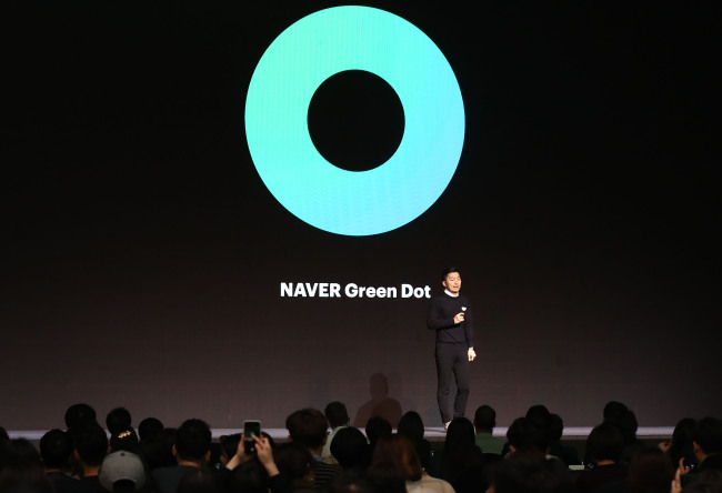
“The ‘green dot’ is Naver’s new design identity and a central part of the company’s efforts to address various changes (in the internet space) that will continue to evolve in the future,” Kim Seung-eon, Naver’s Head of Design, said during a keynote speech at the “Naver Design Colloquium” held Friday in Seoul.
If the “green window” search bar defined Naver as a text-based search engine in the past, the “green dot” is an interactive button that can handle more complex inquiries from users via voice, location image recognition capabilities on top of text, Kim said.
 |
Kim Seung-eon, Naver’s Head of Design (Yonhap) |
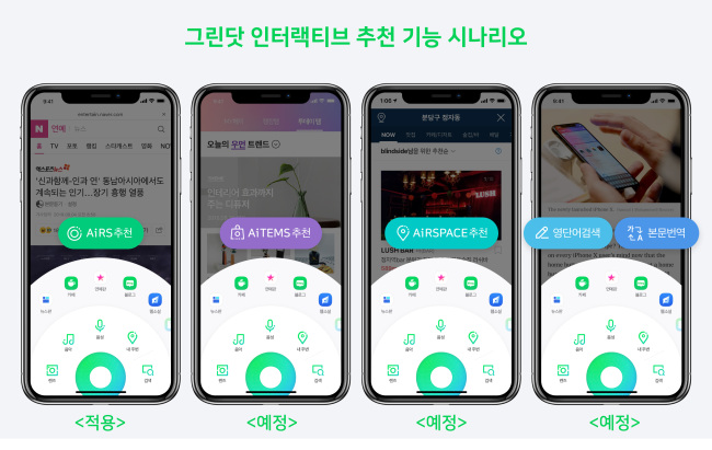
The “green dot,” recently announced as part of Naver’s sweeping mobile page reform plans, is an interactive search button that lets users navigate Naver’s mobile page by making use of various AI-based technologies.
For instance, a user looking at a yellow silk dress can click on the button to receive related content and product recommendations via Naver’s AiRS and AiTEMS algorithms. Foreign-language webpages would be translated into Korean right away using the “green dot.”
With the “green dot,” Naver said it hoped to introduce the new era of “touch-based” search, in place of text-based search using the traditional search bar.
As of now, the starting page of Naver’s mobile page is being changed to display only a search bar and the green dot. Looking ahead, Naver plans to add new personalization options and important notification alert services to the starting page.
 |
Naver`s "Green Dot" interactive search button (Naver) |
With the new blank space, Naver also plans feature a more diverse array of moving logos on its starting page, it said.
In addition, Naver is focusing on revamping the design of its mobile shopping platform, which accounts for 16 percent of daily visitors to its mobile site. It is also improving its video uploading service to make it easier for people to upload user-generated videos.
A variety of new services are being tested out as well through Naver Alpha, the unit in charge of experimenting with new potential service idea.
In its second edition, the 2018 Naver Design Colloquium drew around 550 designers and related officials in digital technology. The event took place at the Dongdaemun Design Plaza in Seoul.
Often referred to as the Korean equivalent of Google, Naver is Korea’s largest internet company, with local dominance over the web search, online shopping, content sharing, news, and weather content.
By Sohn Ji-young (
jys@heraldcorp.com)


![[Herald Interview] Meet 1VERSE, first K-pop boy band to feature North Korean defectors](http://res.heraldm.com/phpwas/restmb_idxmake.php?idx=644&simg=/content/image/2024/11/27/20241127050102_0.jpg)