 |
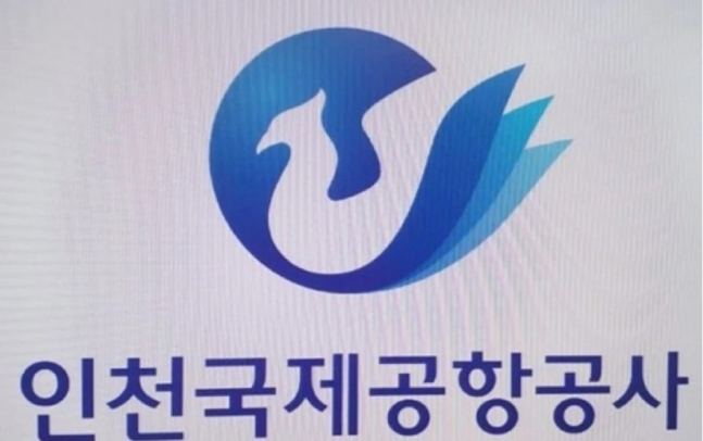
A screenshot of a leaked image of Incheon Airport’s phoenix-inspired logo draft design. (Online community Blind) |
Incheon International Airport Corp. says it is not going forward with a mythical bird-inspired logo for the corporation’s 20th anniversary next year after a leaked image online drew criticism.
In an emailed statement on Sunday, the company confirmed it had ditched the new corporate identity design after “considering the majority’s opinions.”
“It’s regretful that the draft was misreported as an official one,” the company said as it explained it was one of some ten drafts that were being considered.
The confirmation came soon after the company said on Friday morning that a final decision was being made.
The design has been compared to a fried chicken brand after a post on an anonymous online community went viral.
Former lawmaker-turned-branding consultant Son Hye-won slammed the logo in a viral social media post on Saturday.
“In terms of structure, the logo has a lot of issues,” she said before adding, “That fat bird with a thick neck is a phoenix? Who has actually seen the bird?”
An online petition on the presidential office’s website calling for the controversial logo to be withdrawn had gathered over 3,000 signatures as of Monday.
Incheon Airport explained that calls for a new corporate identity were borne out of an internal reshuffle as over 60 business partners were regrouped into three subsidiaries after nearly 2,000 staff were granted permanent positions at the company recently.
Citing experts, the company also said that its current logo, a curvy and linear design, could make the airport “appear to be shrouded in clouds” and that the need to give it a clear and safe image had been raised.
By Yim Hyun-su (
hyunsu@heraldcorp.com)


![[Exclusive] Hyundai Mobis eyes closer ties with BYD](http://res.heraldm.com/phpwas/restmb_idxmake.php?idx=644&simg=/content/image/2024/11/25/20241125050044_0.jpg)
![[Herald Review] 'Gangnam B-Side' combines social realism with masterful suspense, performance](http://res.heraldm.com/phpwas/restmb_idxmake.php?idx=644&simg=/content/image/2024/11/25/20241125050072_0.jpg)

