KT, the nation’s second-largest mobile carrier, said Monday that it would design its products with a signature style to maximize its brand power.
The move comes after KT’s outer packaging for home mobile devices won the prestigious Red Dot Design Best of the Best Award 2012 in the productivity sector.
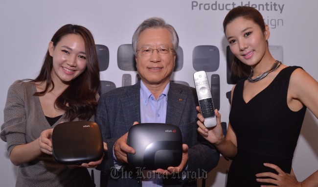
The mobile carrier used the word “product identity” to explain how a product becomes a unique entity under the brand name KT. Citing Apple and different generations of iPod, KT chairman Lee Suk-chae stressed that design has become crucial in defining what can go on to become “iconic.”
 |
KT chairman Lee Suk-chae and models pose with KT mobile devices. (Lee Sang-sub/The Korea Herald) |
“We see designs for bags and other things, but we can also come up with unique design for telecommunications and mobile products. We can sell the design (rather than the product itself) and we can make huge profit out of it,” Lee said in a press conference held in Seoul.
“KT has employed a whole new management system under the slogan ‘design management’ since 2009 with the launching of Olleh,” the KT chairman said. “We applied design management to all products including the brand name, space design, modem, Internet phone, home hub, remote control and all other products that customers lay their hands on.”
The mobile operator company has also developed “a matrix of product identity,” a set of design guidelines that rival companies cannot imitate easily.
By Chung Joo-won (
joowonc@heraldcorp.com)


![[Today’s K-pop] Blackpink’s Jennie, Lisa invited to Coachella as solo acts](http://res.heraldm.com/phpwas/restmb_idxmake.php?idx=644&simg=/content/image/2024/11/21/20241121050099_0.jpg)