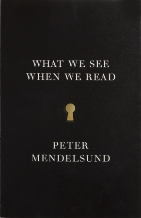
Peter Mendelsund’s “What We See When We Read” may be the liveliest, most entertaining and best illustrated work of phenomenology you’ll pick up this year.
An acclaimed book-jacket designer and art director, Mendelsund investigates, through words and pictures, what we see when we read text and where those images come from.
His breakdown of the reading and visualizing processes yields many insights.
For example, readers of Tolstoy may feel intimately acquainted with Anna Karenina, but that doesn’t mean they’re actually picturing her as a person, Mendelsund writes:
 |
“What We See When We Read” by Peter Mendelsund. (Vintage Original) |
“Most authors (wittingly, unwittingly) provide their fictional characters with more behavior than physical description. Even if an author excels at physical description, we are left with shambling concoctions of stray body parts and random detail (authors can’t tell us everything). We fill in gaps. We shade them in. We gloss over them. We elide. Anna: her hair, her weight ― these are facets only, and do not make up a true image of a person. They make up a body type, a hair color ... What does Anna look like? We don’t know ― our mental sketches of characters are worse than police composites.” Then, playfully, he offers us a police composite sketch of Anna, based on the description in Tolstoy’s novel.
Mendelsund expends some energy on the differences between seeing and understanding ― devoted readers of a novel tend to understand more of a character than they see with their mind’s eye.
Although book-cover design is his trade, he argues against literal illustrations of fictional characters, seeing them as limiting.
He cites the frantic Kafka, worried that the publisher of “Metamorphosis” would try to show the insect form of Gregor Samsa on the cover: “Not that, please not that! The insect itself cannot be depicted. It cannot even be shown from a distance.”
“One should watch a film adaptation of a favorite book only after considering, very carefully,” Mendelsund writes, “the fact that the casting of the film may very well become the permanent casting of the book in one’s mind. This is a very real hazard.”
In one of this friendly book’s bitterest pages, Mendelsund posts an image of Keira Knightley in character as Anna K. and declares this picture “is a form of robbery.” (This explains why I have no interest in seeing any filmed version of “The Great Gatsby,” and why I’m relieved that, so far, no producer has been able to make a movie of “A Confederacy of Dunces.”)
Discussing Virginia Woolf’s “To the Lighthouse,” Mendelsund notes that the pieces of information that could make up our image of a character in a novel may be introduced to us “out of order; the way a puzzle might be.” The novel opens with Mrs. Ramsay, undescribed, speaking to an unknown person.
“As we read on, Mrs. Ramsay becomes a collage, composed of clippings, like the ones in her son James’ book,” Mendelsund writes.
“If fiction were linear we would learn to wait, in order to picture. But we don’t wait. We begin imaging right out of the gate, immediately upon beginning a book.”
Mendelsund describes reading experiences as akin to differences in the way we experience roads. “If books were roads, some would be made for driving quickly ― details are scant, and what details there are appear drab ― but the velocity and torque of the narrative is exhilarating. Some books, if seen as roads, would be made for walking ― the trajectory of the road mattering far less than the vistas these roads might afford. The best book for me: I drive through it quickly but am forced to stop on occasion, to pull over and marvel. These books are books meant to be reread.”
Mendelsund has also just published “Cover” (powerHouse Books, $60), a hardcover featuring his book-cover designs and related working materials. His many striking covers include ones for Stieg Larsson’s “The Girl With the Dragon Tattoo,” Ben Marcus’ “Flame Alphabet,” Wu-Ming Yi’s “The Man With the Compound Eyes,” Charles Yu’s “Sorry Please Thank You,” Glen Duncan’s “The Last Werewolf,” Yu Hua’s “China in Ten Words,” and reissues of the works of James Joyce and Kafka.
Casting “Cover” as the kind of book he would like to have read when he began working in book design, Mendelsund shows working sketches and even failures, including a spread of 21 rejected covers for Geoff Dyer’s “Zona” ― in the end, that title was designed by someone else.
By Jim Higgins
(Milwaukee Journal Sentinel)
(MCT Information Services)


