Following is the fourth in a series of articles in which leading architects discuss their representative work. ― Ed.
For many people, architectural space holds numerous meanings and responses. A space born out of a certain form creates countless stories for pedestrians who walk past the buildings or who look at them from afar; the stories can be different for the builders, the owners and the users.
An architect is a person who gathers and predicts such stories and translates them into a form. Thus, architecture must be common and at the same time uncommon; i.e. it should satisfy traditional and general requirements as well as proposing a new idea through a newly developed common sense. In that regard, architecture is a work lying between the boundaries of the common and the uncommon. It should not be an urban creature that ignores the public benefit and economic logic. It cannot be an artwork that overemphasizes a form, or a work that over emphasizes purposefulness and function.
 |
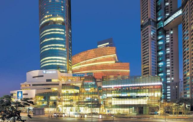
“D-cube City” |
The D-Cube City project started from the process of injecting a new life force into the industrial zone in southwestern Seoul. As a large-scale, complex development, its feasibility and programs continued to change. Moreover, the public benefit could not be overlooked considering the project is such a large part of the urban context. One of the most crucial tasks was to balance the common benefit of the building owner and that of related government officials during the numerous reviewing and building permit processes of the urban planning and architecture project. From the urban scale to the interior coordination, and from the apartment housing of the most conservative design to the retail facility consisting of streamlined mass, D-Cube City was the embodiment of a 10-year architectural project.
The NHN Green Factory, the first ever office building in Korea for an internet portal service provider, was Naver’s first attempt to bring its online image to the offline world. We gave shape to the identity and image and also sought to satisfy the user convenience and operational efficiency. The result is a product of simplicity born out of diversity: The adjustable vertical louvers, applied with five color samples based on the company’s identity color green, present a varied elevation, and the collection of irregular fragments creates a simple and explicit single box-shaped mass. The adjustable vertical louvers made of perforated aluminum panels control the daylight as well as provide a view. The LED installation turns the cladding of the building into a digital art wall. Such an approach satisfies the needs of both the owner and the users, creating an office building that breaks away from the image of existing ones. The NHN Green Factory is a project that proposes an idea about what kind of form and space can exist in architecture on the border of the common and the uncommon while maintaining the daily life of a user and offering a unique experience that cannot be found in other office buildings.
Communication and integration play an important role in architecture. However excellent a concept may be, the world of architecture, unlike that of a fine art, doesn’t easily accept works that cannot communicate with an anonymous public. The design has to be based on universal validity for communication. Uncommon elements can have their persuasive power and force only when they satisfy common conditions, and then bring a new value to architecture. We are now living in the age of overabundance, and that can also be said of architecture. However, architecture that communicates with the common and seeks integration with the uncommon is sufficient to be an alternative proposal to the disorder and confusion in the age of superabundance.
 |
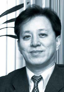
Kim Kwan-joong |
By Kim Kwan-joong


![[Exclusive] Hyundai Mobis eyes closer ties with BYD](http://res.heraldm.com/phpwas/restmb_idxmake.php?idx=644&simg=/content/image/2024/11/25/20241125050044_0.jpg)

![[Herald Review] 'Gangnam B-Side' combines social realism with masterful suspense, performance](http://res.heraldm.com/phpwas/restmb_idxmake.php?idx=644&simg=/content/image/2024/11/25/20241125050072_0.jpg)
