There is the Eiffel Tower in Paris, the Statue of Liberty in New York and the Taj Mahal in Agra. But in Seoul? Many would still find it hard to think of such an iconic landmark.
The South Korean capital has been struggling to come up with its own landscape identity since the late 2000s, after its dramatic shift into a major Asian city from the war-torn, poverty-stricken town.
Its cityscape reflected just that ― the accelerated economic development that focused on profitmaking and industrialization.
Even in the early 2000s, Seoul was notorious for its light pollution resulting from too many signboards ― which were not exactly aesthetically pleasing ― and streets that were not pedestrian-friendly but principally designed for vehicles.
“We needed to simplify things in order to do this, to form an identity of this city,” said Jinny Kang, an architect and the deputy design director at Seoul Metropolitan Government.
In 2007, in order to redefine its identity by improving its cityscape, the Seoul municipal government formed a special task force. In the beginning, its goal was to simplify its busy landscape, by harmonizing and reducing the number of fonts and colors used in public design.
Now, the city’s goal is to offer socially conscious design that is more considerate and beneficial to everyone in the city, regardless of their age, gender and state of health ― and the kind that can even be used in crime prevention.
“We are aiming to form our city identity with both substance and exterior style,” Kang said.
‘Seoul Colors’ and fonts
For two years from 2007, the special team came up with four Korean fonts for advertisers and printmakers to use for free, inspired by the distinctively curvy lines of Korea’s traditional buildings, as well as the gentle waves of the Hangang River.
The team also introduced 600 hues, dubbed “Seoul Colors,” to be used in public design, based on the colors of Seoul’s traditional architecture and natural treasures.
For example, Seoul Orange, one of the top 10 Seoul Colors selected by the SMG, was inspired by the distinctive shade of Korea’s traditional floral walls. The color, which is a unique shade of dark orange with a hint of brown, is now the official color of all taxi vehicles in Seoul.
“We also advise those who use the (selected Seoul) colors to be considerate,” Kang told The Korea Herald. “Public design is not about meeting an individual’s taste, but it’s about being inclusive and practical. For example, if a text in white is written on a light green background for a public sign, those with weak eyesight find it hard to read.
“But using white text on a dark background can benefit as many people as possible, regardless of the condition of their eyesight,” she continued.
“So for white texts, we recommend Seoul Dark Gray, a dark gray color inspired by the color of giwa, Korea’s traditional roof tiles.”
Socially conscious, inclusive design
But Seoul has gone a step further. It also has come up with a design guideline for social welfare facilities, such as nursing homes and centers for the physically disabled. Kang said a lot of the facilities needed to spend extra money to renovate their properties, as the way they were initially designed greatly inconvenienced those who used their services.
For example, a nursing home used strong, direct lighting in its patient rooms, which was harmful to the eyesight of immobile patients who had to lie down in the same position for most of the time. The guideline was to help designers of such facilities to avoid causing such harm to the citizens.
The Yeomni-dong project and crime prevention
One of Kang’s best-known projects is the renovation of the soon-to-be demolished residential community in Yeomni-dong, which had been affected by decades of dispute over redevelopment plans.
After the area was designated for redevelopment in 2010, many of its residents left, and the dimly lit, deserted area became vulnerable to crime. Many seniors stayed in the neighborhood of shabby houses and narrow alleys, which were also frequented by migrant laborers who were looking for cheap, temporary places to stay.
“We wanted to connect the residents to one another so they could form a sense of community and care for one another,” Kang said.
“But in the beginning, most of them were very cynical. They said the area was going to be demolished anyway. There was a church in the area, where many of them hold weekly Wednesday services. We would wait in front of the church and try to persuade them when they were leaving the church.”

 |
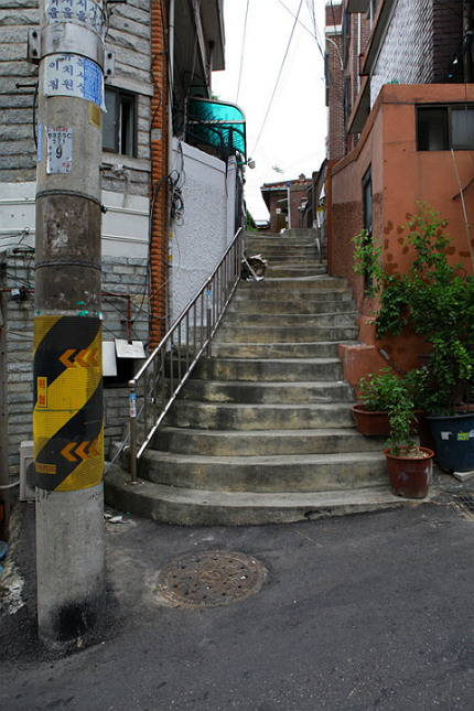
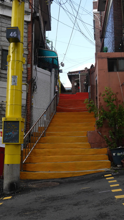
A residential area in Yeomni-dong, Seoul, is pictured before (top) and after being redesigned. Bright yellow numbered utility poles were put up in crime-ridden spots in the soon-to-be demolished area for redevelopment. (SMG) |
After the renovation, the area now has a newly created walking trail dubbed Salt Way ― the town was once a thriving district where salt merchants lived together during the Joseon Dynasty ― that links crime-ridden spots with utility poles numbered from 1 to 60.
“The point is to make it easier for residents to let the police know exactly where they are in case of an emergency,” Kang said.
“Because of the narrow alleys and disorganized labeling of the addresses, many residents feared they would find it difficult to describe the location should an emergency situation arise. Now they could tell the police ‘I am near pole No. 19,’ instead of spending their time describing the surroundings.”
Renovating the area was the first result of Seoul’s Crime Prevention through Environmental Design project, which is based on the principle that good design can bring positive changes to society by discouraging potential criminals.
The future
Last year, a community center named Salt Naru opened in the neighborhood. Elderly residents grow vegetables there, while children get tutoring from students of nearby schools ― Ewha Womans University, Sogang University and Yonsei University.
The city government last month announced that it would renovate a 100-meter bustling downtown street connecting Cheonggyecheon-ro to Eulji-ro to be more pedestrian-friendly.
For example, crosswalks on the street will be elevated to serve simultaneously as a speed bump. The street will also be more wheelchair-friendly and free of stairs, complete with Braille signs and tactile paving.
“The point is to make the city more accessible and safer,” said You Chae-hee from the SMG’s Public Design Division. “That’s the primary purpose of public design (in Seoul).”
By Claire Lee (
dyc@heraldcorp.com)


![[Today’s K-pop] Blackpink’s Jennie, Lisa invited to Coachella as solo acts](http://res.heraldm.com/phpwas/restmb_idxmake.php?idx=644&simg=/content/image/2024/11/21/20241121050099_0.jpg)
